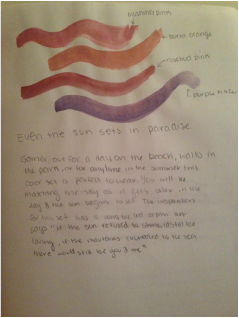
Line dynamics
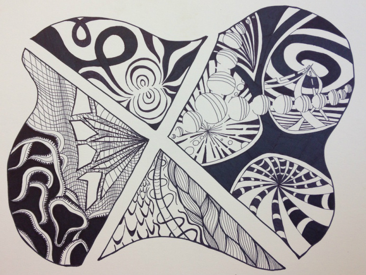
In the beginning I hit a rough patch not knowing how I wanted to incorporate the different ways to achieve depth in each section. I starched off with the shape as a simple blob being sectioned and spaced apart. I then took my 4 favorite sketches from my sketchbook and put one in each section. After that I used to sketchbook to see which designs would look best with it. After going at it for a while, it wasn't as much of a struggle like in the beginning. I ended up loving what I designed.
Shape transformation
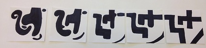
This project I didn't enjoy as much as the previous one. At first I didn't follow the directions correctly so I felt the need to redo it all rather than tweaking the other one so that it would work better. But i started off with geometric shapes slowly transforming into curvy organic ones. I attempted to have a face show in the curvy one. I feel like I could have added more to it but i still wanted there to be negative space.
balancing act
|
|
|
|

|
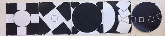
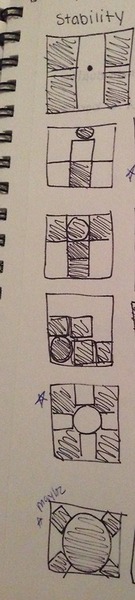
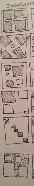
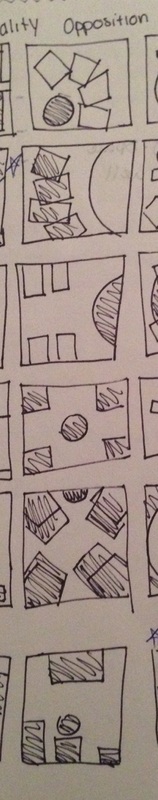
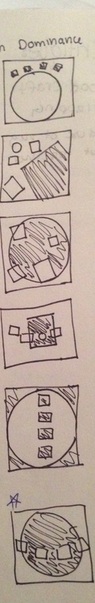
In order from left to right: Stability, individuality, dominance, opposition, and rework of dominance. I enjoyed doing this project and messing with the shapes and deciding which arrangement worked best for what they had to represent. I also like that everyone interpreted a different way in class when looking them as a whole. I used photoshop for these so that there would be good craft and equal measurements.
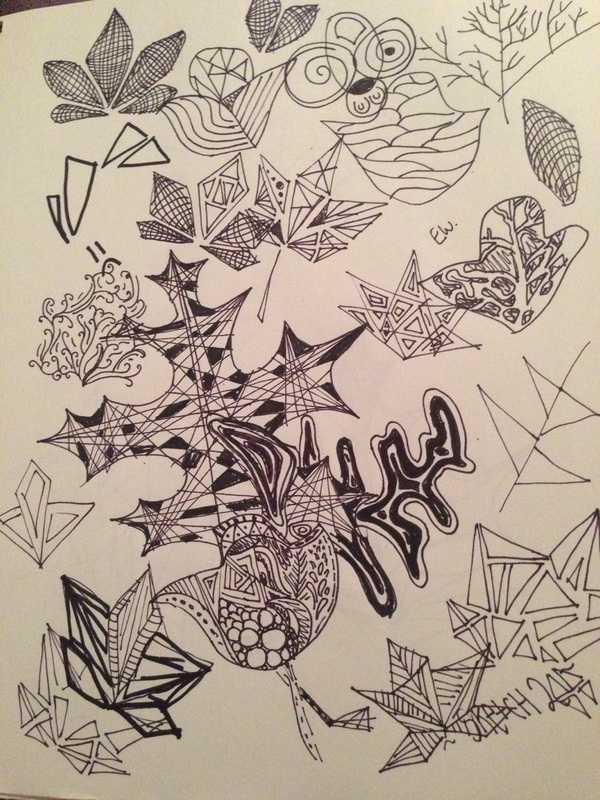
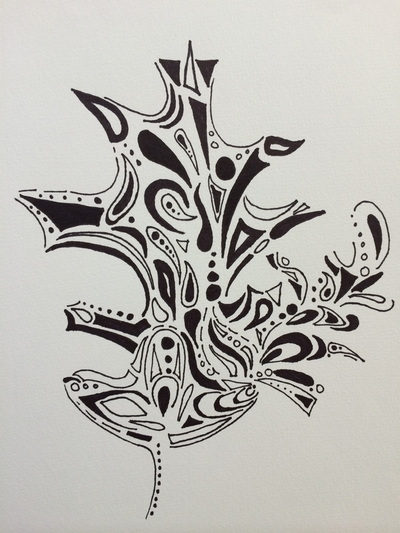
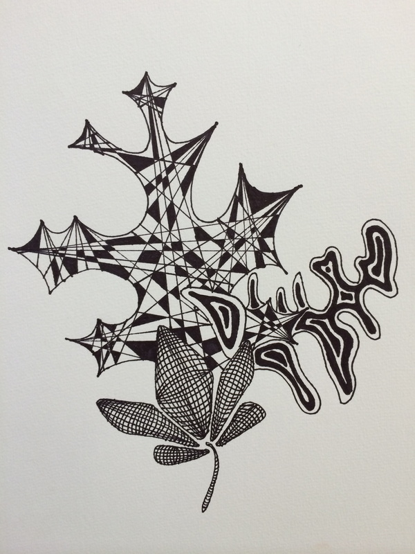
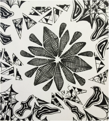
Nature abstractions
|
|
|
|
|
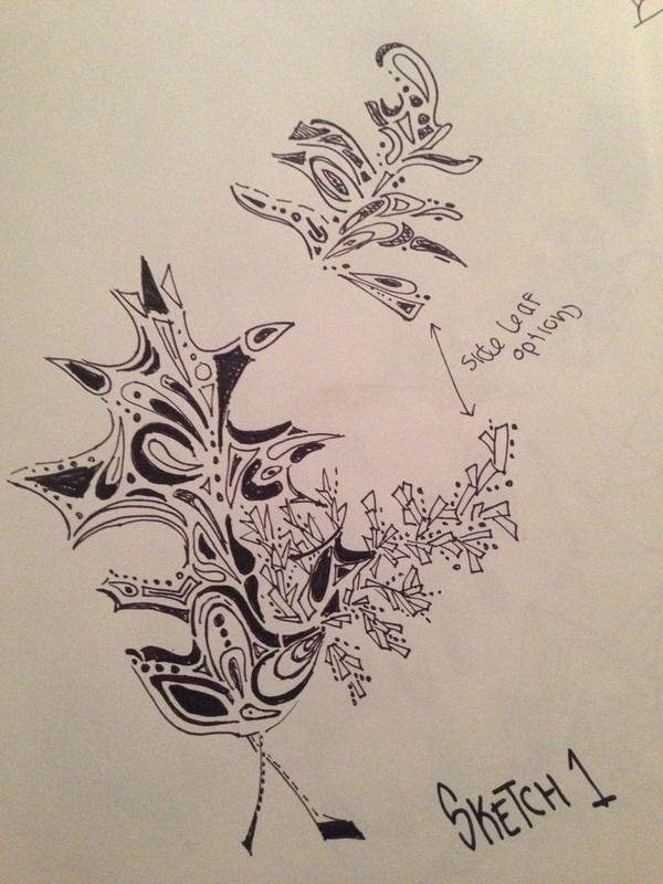
For this project we had to take something from nature and turn it unto an abstraction. I chose different kind of leaves that I thought had interesting shapes and a variety of them. I wanted it to be apparent that it was a leaf although abstracting it, which was challenging especially for the pine leaves. Then we were to take one of the abstractions and make another abstraction from it! I made a flower from one of the leaves and used the rest as an interesting background! I really liked how each of them turned out and it was one of my favorite projects this semester. N
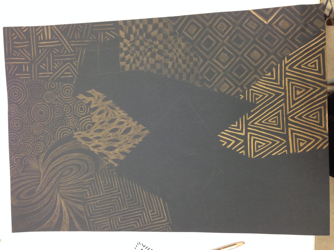
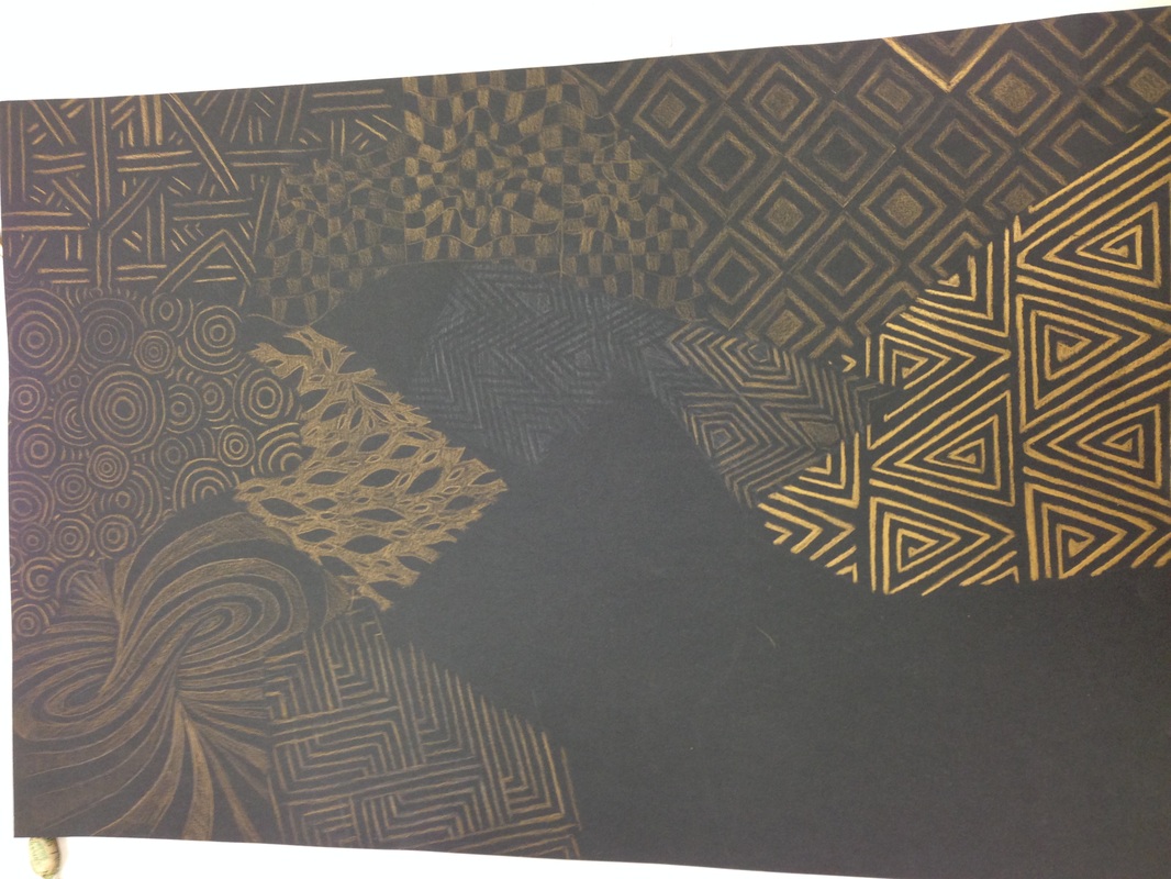
Pattern saturation
|
|
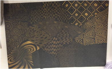
For this project we had to create a shape, cut it out, and then repeat it all over the paper. From there we would erase lines leaving 7-13 different shapes. In each shape we would put a pattern inside of it that would range in value from 5 being the lightest and 1 being the darkest. The goal was to show each shape overlapping with each other creating depth. I enjoyed the project and drawing in different shapes. My favorite part of the composition was the bottom left corner that looks like a funnel. I do however wish I had used white instead of gold for the project but still love how it turned out!
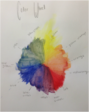
COLOR RESEARCH
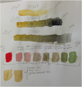
|
|
|
RED: associated with health, compels people to buy things, signals danger because its very visible.
YELLOW: inspires original thought, activates left part of brain, and used for caution signs
WHITE: represents a clean slate, too much is isolating, shows cleanliness.
ORANGE: helps bounce back from disappointments, used to promote food products, is the most neglected color.
GREY: neutral color, in business represents powerful, 50shade of grey= not everything is black and white.
BROWN: symbolizes organization, UPS uses it to ensure customers their packaging will get where they wanna go, if you dream of brown is means you are/will be lucky with money
PINK: combines the passion of red and pureness of white,pink logos are for women, back in the day pink was for boy and blue was used for girls.
PURPLE: represents the higher self, purple in nature is calming and rare so its sacred, stands for mystery (cashire cat)
GREEN: down to earth person, used to advertise drugs and medical products, and is in the middle of the visual spectrum so it represents harmony.
BLUE: "got the blues" came from alcohol withdrawal.. considered the blue devil, used on cleaning products because it represends water and the sky,
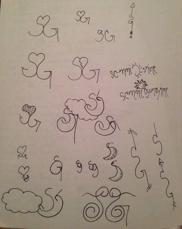
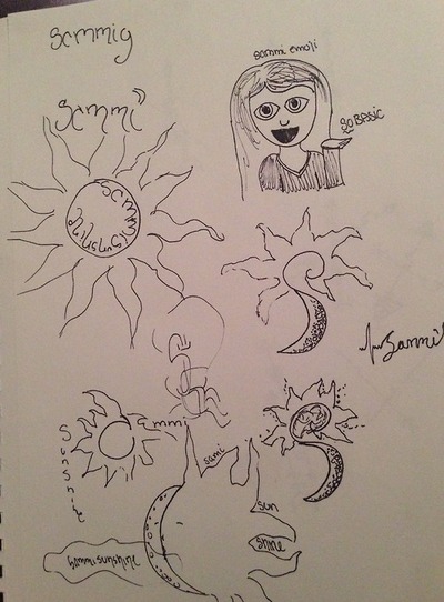
logo/branding
|
|
|
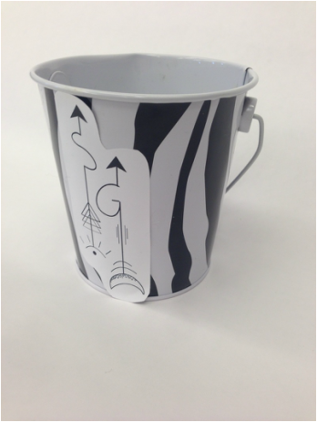
|
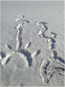
|
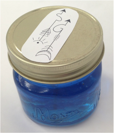
|
For this project we had to create a logo on photoshop and then brand different items with our logo. Creating the logo was fun for me since I'm a graphic design major so I liked being able to my project on a software I was aware of. During my senior year of high school we had to create a logo for ourselves in class so it was a nice change to revisit it and redesign it. We then had to brand stuff with our logos. I chose a candle that was made by my mom, a pail to hold pens/pencils in, and i simplified it and made it in the snow. Its cool to have things with my logo on it but the white background on them are very distracting.
logo cube
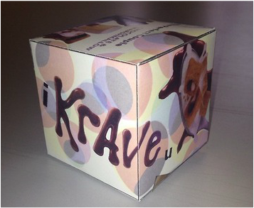
|
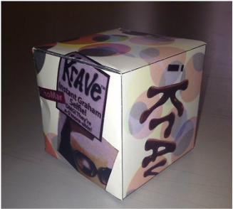
|
For this project we had to take a packaging and redesign it. We could either make the cube look as if it still represents the project its advertising or we could make it our own. I didn't want to necessarily go too far in either direction so i went kin of in-between. I enjoyed this project because again we got to use photoshop to create it. I used a Krave cereal box as the packagin for this project. And incorporated it into one of my favorite songs "crave you" and put the lyrics as "I krave you"
